
Ensuring bathroom color contrast safety is essential for creating a safe and accessible environment, especially for individuals with visual impairments or those at risk of falls. The importance of color contrast in a bathroom cannot be overstated. By strategically using colors, homeowners can enhance visibility, prevent accidents, and create a welcoming space for everyone.

What is Bathroom Color Contrast Safety?
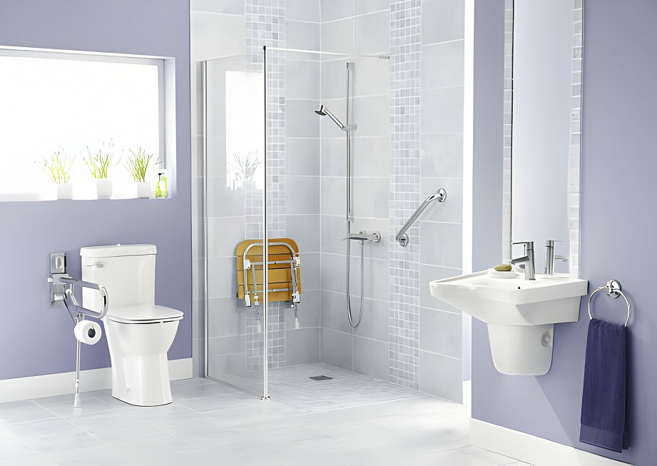
Bathroom color contrast safety refers to the use of contrasting colors to distinguish various elements and features in a bathroom. This approach helps individuals easily identify critical fixtures, such as toilets, sinks, and grab bars, thereby promoting safety and accessibility.
Why is Color Contrast Important in Bathrooms?
The bathroom is a space where safety is paramount. Slippery floors, sharp corners, and water hazards make it essential to take precautionary measures. By incorporating color contrast, you can enhance the overall safety of your bathroom. Contrasting colors make it easier for individuals to navigate the space without confusion, reducing the risk of accidents.
The Role of Color Contrast in Preventing Falls
Falls are a common concern in bathrooms, particularly for seniors and children. By using contrasting colors on floors, walls, and fixtures, you can improve depth perception and help individuals maintain balance. For example, using a dark-colored floor with a lighter-colored wall can clearly define the boundaries, reducing the likelihood of tripping.
Enhancing Visibility for Visually Impaired Individuals
For individuals with visual impairments, color contrast is a crucial aspect of bathroom design. By using distinct colors for essential fixtures, such as toilets and sinks, you can improve their visibility and ensure that they are easily distinguishable.
Key Areas to Focus on for Color Contrast
Flooring
Choosing the right flooring is vital for bathroom safety. Opt for textured, non-slip flooring that contrasts with the walls. For more information on safe flooring options, check out our article on flooring with texture.
Walls
Walls should contrast with the floor and fixtures. Consider using light-colored walls with darker fixtures or vice versa. This contrast will help define the space and make essential features stand out.
Fixtures
Fixtures such as toilets, sinks, and bathtubs should have a contrasting color to the walls and floors. This will help individuals easily identify and locate them within the bathroom.
Design Tips for Color Contrast in Bathrooms
Using Complementary Colors
Complementary colors are those that are opposite each other on the color wheel. Using these colors can create a striking contrast that enhances visibility. For instance, pairing blue with orange or yellow with purple can create a vibrant and safe bathroom environment.
Incorporating Light and Dark Tones
Utilizing a combination of light and dark tones can significantly improve color contrast. A dark-colored floor paired with light-colored walls can help define the space and prevent accidents.
Considering Texture and Patterns
Using textured or patterned materials can enhance contrast and provide additional grip, reducing the risk of slips and falls. This is especially important for flooring and walls.
Additional Safety Measures
Grab Bars and Handrails
Grab bars and handrails are essential safety features in any bathroom. Ensure that they contrast with the surrounding walls to make them easily visible and accessible. Learn more about bathroom safety sensors for added security.
Lighting
Proper lighting is crucial for visibility and safety. Ensure that your bathroom is well-lit, with lights that enhance the color contrast of the room. Consider using LED lights for their brightness and energy efficiency.
Use of Color Blocking
Color blocking involves using large blocks of contrasting colors to define different areas of a room. This technique can be particularly effective in bathrooms to highlight essential features and create a visually appealing space.
Common Mistakes to Avoid
Overusing Bright Colors
While bright colors can enhance visibility, using too many can create visual clutter and confusion. It is essential to strike a balance and use colors strategically to highlight critical areas.
Ignoring Small Details
Paying attention to small details such as towel racks, soap dispensers, and light switches is essential. Ensure these elements contrast with their surroundings for easy identification.
Resources for More Information
For more information on improving bathroom safety, consider visiting external resources such as Griswold Care’s blog on bathroom safety for elderly adults.
Conclusion
Incorporating bathroom color contrast safety measures is a simple yet effective way to enhance the safety and accessibility of your bathroom. By focusing on key areas such as flooring, walls, and fixtures, and using strategic design techniques, you can create a safe and welcoming space for everyone.

FAQs
What is the best color for bathroom safety?
The best colors for bathroom safety are those that offer a high contrast to each other. For example, dark floors with light walls or vice versa can help define spaces and prevent accidents.
How can I improve bathroom safety for seniors?
Improving bathroom safety for seniors can be achieved by incorporating features such as grab bars, non-slip flooring, and adequate lighting. For more tips, visit our article on childproof faucet covers.
What are some common bathroom safety features?
Common bathroom safety features include grab bars, non-slip mats, adequate lighting, and color-contrasting elements that enhance visibility and accessibility.
This article contains affiliate links. We may earn a commission at no extra cost to you.